Tuesday, December 11, 2018

Remote Sensing Lab 8: Spectral Signature & Resource Monitoring

Goal and Background:

The goal of this lab is to perform basic monitoring of Earth resources using remote sensing band ratio techniques. With the use of the band ratio techniques, one can monitor the health of vegetation and soils. In this lab, there will be gained experience on the measurement and interpretation of spectral reflectance of various Earth surface and near surface materials captured by satellite images. Additionally, there will be the process of collecting spectral signatures from remotely sensed images, graphing them, and then finally, performing an analysis on them.

Methods: 

Erdas Imagine and ArcMap were used to complete this lab.

Part One: Spectral Signature Analysis

The first part of this lab included using an Landsat ETM+ Image taken in 2000 to collect spectral signatures of various Earth surface features.

12 different types of Earth surfaces features were collected and the spectral reflectance was plotted:

  1. Standing Water
  2. Moving Water
  3. Deciduous Forest
  4. Evergreen Forest
  5. Riparian Vegetation
  6. Crops
  7. Dry Soil
  8. Moist Soil
  9. Rock
  10. Asphalt Highway
  11. Airport Runway
  12. Concrete Surface


To start this process, a polygon was drawn on a standing water surface, in this case it was Lake Wissota. Next, the Raster tools were activated and Supervised was chosen and then finally Signature Editor was selected. Once the Signature Editor window opened, the Create New Signatures from AOI was clicked to add the previously drawn polygon (Figure 1). The default value of Class was changed to Standing Water. By clicking on the Display Mean Plot Window tool in the Signature Editor window, the spectral plot of the signature will be shown. This same process was then completed for the remaining 11 Earth surface features (Figure 2).

Figure 1: New Signature Created From the Drawn Polygon

Figure 2: All 12 Signatures

Part Two: Resource Monitoring

Part two of this lab is where basic monitoring of Earth resources using remote sensing band ratio techniques to monitor the health of vegetation and soils were performed. 

Section One: Vegetation Health Monitoring

First, a simple band ratio was performed by implementing the normalized difference vegetation index (NDVI) on an image of Eau Claire and Chippewa counties.  This index is computed as so: NDVI=(NIR-Red)/(NIR+Red). To start this process, the Raster tools were activated and Unsupervised was chosen and then NDVI was selected. After the parameters were set, the NDVI image was created. Lastly, the NDVI image was opened in ArcMap to create a map displaying the abundance of vegetation in Eau Claire and Chippewa counties. 

Section Two: Soil Health Monitoring

First, a simple band ratio was performed by implementing the ferrous mineral ratio on an image of Eau Claire and Chippewa counties. This ratio is computed as so: Ferrous mineral=(MIR)/(NIR). To start this process, the Raster tools were activated and Unsupervised was chosen and then Indices was selected. After the parameters were set, the ferrous minerals image was created. Next, the ferrous minerals image was opened in ArcMap to create a map displaying the spatial distribution of ferrous minerals in Eau Claire and Chippewa counties. 

Results

Although each curve is different, there are three main trends that can be observed from the overall results (Figure 3). The deciduous forest, evergreen forest and riparian vegetation surfaces all generally follow the same trend of curves from Band 1 to Band 6. This makes sense due to similar vegetation and most likely similar moisture content. The standing water and moving water surfaces almost followed the exact curving trend from Band 1 to Band 2 because they are both water surfaces. The surfaces of moist soil, rock, asphalt highway and concrete surface also all had curves that followed similar trends from Band 1 to Band 6. This could be explained by the fact that they are all relatively flat surfaces. 

Figure 3: The 12 Signatures Plotted
 The results from the NDVI index display the difference in vegetation in Eau Claire and Chippewa counties (Figure 4). The heaviest vegetation is located in the northeast region of Chippewa County. It is interesting that known water surfaces in this image are labeled as No Vegetation and not Mostly Water.

Figure 4: Differences in Vegetation


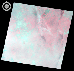
The results from the ferrous minerals indices display the differences in minerals across both counties (Figure 5). The northeast region of Chippewa County has the largest area of mostly vegetation between both counties. The areas of high and moderate ferrous minerals are in the same spatial regions where the mostly water and no vegetation regions are in the vegetation map. The western sides of both counties are where the overall abundance of high and moderate ferrous minerals are located. Specifically, there is a large cluster of moderate and high ferrous minerals around the northwestern side of Lake Wissota. 


Figure 5: Differences in Ferrous Minerals

Sources:

Satellite image is from Earth Resources Observation and Science Center, United States Geological Survey

Thursday, December 6, 2018

Remote Sensing Lab 7: Photogrammetry

Goal and Background:

The goal of this lab is to learn key photogrammetry skills by completing tasks on satellite images and aerial photographs. A few specifics of this lab include: calculating relief displacement, measurement of areas and perimeters of features, and developing the understanding of the mathematics behind the calculation of photographic scales. This lab is an introduction to performing orthorectification on satellite images and stereoscopy.


Methods: 

Erdas Imagine was used to complete this lab.


Part One: Scales, Measurements and Relief Displacement


The first part of this lab included determining the scale for aerial photographs. The first calculation was S=PH/GD. A ruler was used to measure the distance between two points on the aerial photograph. The remaining numbers that replaced the values of the equation were provided in the lab. The equation appeared as so before if was solved: S=2.5in(2.5)/8822.74(2.5)ft. 


The second calculation was S=f/(H-h). A ruler was used to measure the distance between two points on the aerial photograph. Once again, the remaining numbers that replaced the values of the equation were provided in the lab. The equation appeared as so before it was solved: S=152mm/(20,000ft - 796ft).


The last section of part one used a calculation for relief displacement in the aerial photograph. This calculation was D=hxr/H. A ruler was used to measure the height of a smoke stack in the photo. Again, the remaining numbers that replaced the values of the equation were provided by the lab. The equation appeared as so before it was solved: D=1379x10.5/390x12.


Part Two: Stereoscopy

In the second part of the lab, GCPs were used to create an anaglyph of the city of Eau Claire. To start this process, an image of Eau Claire was brought into one viewer and a DEM of the same area was brought into a second viewer. Next, the anaglyph tool was used to create the output image. This same process was completed again with the same Eau Claire image but instead of a DEM, a DSM was used. The anaglyph tool was used to create the output image between the Eau Claire image and the DSM. 

Part Three: Orthorectification

In this part of the lab, a planimetrically correct orthoimage was created using the Erdas Lecia Photogrammetric Suite (LPS). A SPOT satellite image and an orthorectified aerial photo were both used as the sources for ground control measurements.

A total of 12 GCP points were collected. The first two were added manually (Figure 1) the remaining points were added using the automatic (x.y) drive function to approximate the GCP location in the image file based on the GCP position in the reference image.


Figure 1: Adding the First Two GCP's
After collecting all of the points, a triangulation was performed. This establishes the mathematical relationship between the images in the block file, the sensor model, and the ground. After running the model the triangulation report was verified to make sure the model ran correctly (Figure 2). This step supplies the exterior orientation information needed. 


Figure 2: Summary of Triangulaiton

Lastly, the orthorectification process was completed that removes relief displacements and other geometric errors to create an image that displays objects in their correct x, y positions. At this time all of the necessary columns are green in the Photogrammetry Interface indicating that all of the processes have been completed (Figure 3). 


Figure 3: Status of Photogrammetry Interface
Results:

Part One:


Calculation one: 1:42,349

Calculation two: 1:38,509
Calculation three: 0.3inches

Part Two:

The results from the using the anaglyph tool (Figure 4). The anaglyph image on the left was created with the DEM and the anaglyph image on the right was created with the DSM. The DSM represents all features on the ground surface and the DEM only represents the bare earth ground which is why the DSM has better quality. Using 3D glass, features such as vegetation appear 3D in the DSM anaglyph image. 


Figure 4: The anaglyph image on the left was created with the DEM and the anaglyph image on the right was created with the DSM. 

Part Three:

The results from the orthorectified images (Figure 5). The degree of accuracy of spatial overlap at the boundaries of the two orthorectified images is very high. With the use of the Swipe tool, I noticed that the river leading off the border of one of the orthorectified images to the other looks very smooth and almost perfect. I also examined the connections of roads between both orthorectified images and they look like they almost line up perfectly as well. There is spatial accuracy with natural features as well as man made features.


Figure 5: Results from the Orthorectified Images


Sources:

National Agriculture Imagery Program (NAIP) images are from United States Department of Agriculture, 2005.
Digital Elevation Model (DEM) for Eau Claire, WI is from United States Department of Agriculture Natural Resources Conservation Service, 2010.
Lidar-derived surface model (DSM) for sections of Eau Claire and Chippewa County are from Eau Claire County and Chippewa County governments.
Spot satellite images are from Erdas Imagine, 2009.
Digital elevation model (DEM) for Palm Spring, CA is from Erdas Imagine, 2009. 
National Aerial Photography Program (NAPP) 2 meter images are from Erdas Imagine, 2009.  


Monday, November 19, 2018

Remote Sensing Lab 6: Geometric Correction

Goal and Background:

The goal of this lab was to introduce geometric correction. This lab covered two major types of geometric correction. These correction types are usually used for satellite images as part of the preprocessing activities prior to the extraction of biophysical sociocultural information from satellite images. During the process of this lab, a United States Geological Survey 7.5 minute digital raster graphic image of the Chicago Metropolitan Statistical Area was used to collect ground control points (GCPs). Additionally, a corrected Landsat TM image for eastern Sierra Leone was used to rectify a geometrically distorted image.

Methods:

Erdas Imagine was used to complete this lab.

Part One: Image-to-Map Rectification

In the first part of the lab, a USGS 7.5 minute digital raster graphic image (Chicago_drg.img) of the Chicago region was added to one viewer and then another Chicago region image (Chicago_2000.img) was added to the second viewer. The Chicago_2000.img was highlighted because that was the image that was going to be rectified. Next, Multispectral was selected and the Control Points were clicked. This activated the Multipoint Geometric Connection window. The next task is to start adding the GCPs to the images, but the default GCPs need to be deleted first. In this process, a first order polynomial transformation was performed so there needed to be at least three pairs of GCPs. However, four pairs were added to ensure that the output image would have a good fit. To perform this task, the Create GCP tool was selected and the first GCP points were added to the Chicago_drg.img and the Chicago_2000.img. To display the reference coordinates easier over the images, the color of the points was changed to purple. Three more GCP points were added to the image to have a total of four. To ensure the accuracy of the GCPs, the Root Mean Square (RMS) error should be 2.0 or below for part one (Figure 1). The GCPs were repositioned multiple times to try and achieve total accuracy. Once the RMS error was below 2.0, the Display Resample Image Dialogue tool was selected to perform the geometric correction. All of the parameters were left as default in the resample image window and the tool was run.

Figure 1: RMS Error Below 2.0 With 4 GCPs


Part Two: Image-to-Image Registration

In part two of the lab, two new images were added to separate viewers. One of the images (sierra_leone_east1991.img) has serious geometric distortion. The second image (sl_reference_image.img) is an already referenced image. The Swipe tool was used to show the contrast between the referenced image and the geometrically distorted image by moving the slider tab left and right (Figure 2).

Figure: Swipe Tool Showing the Contrast Between the Referenced Image and the Geometrically Distorted Image
Next, Multispectral was selected and the Control Points were clicked. Once again, the default GCPs were deleted. In part two, a third order polynomial transformation was performed so there needed to be at least ten pairs of GCPs. A total of 12 GCPs were added to ensure that the output image would have a good fit. To ensure the accuracy of the GCPs, the RMS error should be 0.5 or below this part because at this point there is some experience (Figure 3). The points were repositioned multiple times to achieve a low enough RMS error. Once the RMS error was 0.5 or below, the Display Resample Image Dialogue tool was selected to perform the geometric correction. All of the parameters were left as default in the resample image window and the tool was run.

Figure 3: RMS Error Below 0.5 With 12 GCPs
Results:

Figure 4 is the geometrically corrected image from part one after using the Display Resample Image Dialogue tool. This geometrically corrected image was the result of a USGS 7.5 minute raster digital raster graphic image of the Chicago region and then another Chicago region image. There was minimal distortion on the Chicago image so only a first order polynomial transformation was needed. A nearest neighbor resampling method was used used to complete the spatial interpolation.


Figure 4: Result of Geometrically Corrected Image Part One
Figure 5 is the geometrically corrected image from part two after using the Display Resample Image Dialogue tool. This geometrically corrected image was the result of an already reference image and a severely geometric distorted image. Since there was serious distortion on one of the images, a third order polynomial transformation was required. A bilinear resampling method was used used to complete the spatial interpolation.

Figure 5: Result of Geometrically Corrected Image Part Two
Figure 6 is showing the contrast between the original referenced image and the geometrically corrected image using the Swipe tool.

Figure 6:S wipe Tool Showing the Contrast Between the Original Referenced Image and the Geometrically Corrected Image

Sources:
Satellite images from Earth Resources Observation and Science Center, United States Geological Survey Digital raster graphic (DRG) from Illinois Geospatial Data Clearing House.  


Sunday, November 11, 2018

Remote Sensing Lab 5: LiDAR Remote Sensing

Goal and Background:

The goal of this lab is to gain the skills and knowledge on LiDAR data structure and processing. This lab has two specific objectives. First, there will be processing and retrieval of various surface and terrain models. Second, there will be processing and creation of an intensity image and other derivative products from a point cloud. This lab will include work with LiDAR point clouds in a LAS file format. Understanding LiDAR processing is important in the field of remote sensing as it is experiencing a significant growth in job creation. 

Methods:

Erdas Imagine and ArcMap were used to complete this lab.

Part One: Point Cloud Visualization in Erdas Imagine:

In the first part of the lab, LiDAR point clouds were opened in Erdas Imagine. Each LAS file was examined to determine whether there was an overlap of points at the boundaries of tiles. Two important facts that should be retrieved from the data are the metadata and the tile index. The tile index file was then opened in ArcMap to be viewed.

Part Two: Generate a LAS dataset and explore lidar point clouds with ArcGIS:

The first step in this process was to open ArcMap and create a LAS Dataset from the LAS folder and name it Eau_Claire_City.lasd. Next, the LAS Dataset Properties window was opened and all of the necessary LAS files were added. After that, the Statistics tab was selected and the statistics were calculated (Figure 1). Once the statistics were calculated, an assigned coordinate system was chosen in the XY Coordinate System tab. For this lab, the Nad 1983 HARN Wisconsin CRS Eau Claire (US FEET) was most appropriate. After that, the Z Coordinate System tab was selected. NAVD 1988 US feet was chosen for the vertical coordinate system.
Figure 1: Eau_Claire_City.lasd Statistics
Eau_Claire_City.lasd can now be displayed. Eau_Claire_City.lasd appeared as a LAS Dataset tiles with red boundaries. So, a shapefile of Eau Claire County was added to the layout to confirm that the LAS Dataset was spatially located correctly (Figure 2). The data from the LAS Dataset would not display until zoomed in to a specific tile. For the points to show, the Layer Properties Window needed to be opened to the Symbology tab. Once there, the natural breaks was set to 8 classes.
Figure 2: The Eau Claire County Shapefile with the Eau_Claire_City.lasd.

The different Classification Codes and Returns were examined and familiarized. Additionally, the LAS Dataset Profile View tool was used to examine the side profile of a bridge in point cloud form (Figure 3). This tool was used as an aid in visualization.


Figure 3: The Side Profile of a Bridge Using the LAS Dataset Profile View tool
Part Three: Generation of LiDAR Derivative Products

Section 1: Deriving DSM and DTM Products From Point Clouds

The first product that was generated was a Digital Surface Model (DSM). The layer was set to display Points by elevation and filtered to First Returns. Before creating the derivative product, the LAS Dataset needed to be converted to a raster output. This was done by utilizing the LAS Dataset to Raster tool. The sampling type was set to cellsize and the sampling value was set to 6.56168 (2 meters). The measuring tool was used to confirm that the cell size of the output raster was 2 meters. To enhance the DSM, a hillshade was created using the Hillshade tool.  6.56168

The second product that was generated was a Digital Terrain Model (DTM). The layer was set to display Points by elevation but this time it was filtered to Ground. Once again, the LAS Dataset to Raster tool was used. The sampling type was set to cellsize and the sampling value was set to 6.56168 (2 meters). After the DTM was created, the Hillshade tool was used again to enhance the DTM.

Section 2: Deriving LiDAR Intensity Image From Point Cloud

In this section, a LiDAR intensity image was generated. The layer was used again set to display Points by elevation and filtered to First Returns. The LAS Dataset to Raster tool was also used again except the value field was set to Intensity. The output image was then opened in Erdas Imagine for a more enhanced display.

Results:

Figure 4 is the output DSM from the LAS Dataset to Raster tool using the First Return filter. The lighter and darker grays show difference in elevation with the lighter grays displaying a high elevation and the darker grays displaying a low elevation. DSM's include buildings and vegetation on the surface.
Figure 4: DSM 

Figure 5 is the output Hillshade of the DSM. The hillshade enhances the DSM by displaying a 3D representation of the surface. Buildings and vegetation are clearly seen on the Hillshade created from the DSM. This type of hillshade would be useful when analyzing any features that reside on top of earths surface. 

 Figure 5: DSM Hillshade
Figure 6 is the output DTM from the LAS Dataset to Raster tool using the Ground filter. The lighter and darker grays show difference in elevation with the lighter grays displaying a high elevation and the darker grays displaying a low elevation. DTM's include the bare earth surface.
Figure 6: DTM


Figure 7 is the output Hillshade of the DTM. The hillshade enhances the DTM by displaying a 3D representation of the surface. Because the DTM Hillshade is just displaying the bare earth surface, less detail is shown compared to the DSM Hillshade. This type of hillshade would be useful when analyzing the true elevation of the earths surface. 
Figure 7: DTM Hillshade 
Figure 8 is the intensity image displayed in ArcMap. The image appears very dark and it is hard to distinguish between objects.
Figure 8: Intensity Image Displayed in ArcMap
Figure 9 is the intensity image displayed in Erdas Imagine. The image is now enhanced and is much brighter and clearer. Objects can be identified and spatial connections can be made.

Figure 9: Intensity Image Displayed in Erdas Imagine

Sources:

LiDAR point cloud and tile index from Eau Claire County, 2013.


Friday, October 26, 2018

Remote Sensing Lab 4: Miscellaneous Image Functions


Goal and Background:

The goal of this lab is to gain the skills and knowledge about seven different miscellaneous image functions:
1). Utilizing the Inquire box or delineating an Area of Interest (AOI) to create an image subset.
2). Optimize the image spatial resolution by creating a higher spatial resolution image from a coarse        resolution image.
3). Introduction to the radiometric enhancement techniques.
4). Familiarizing linking a satellite image to Google Earth.
5). Introduction to resampling techniques.
6). Exploring the process of image mosaicking.
7). Introduction to binary change detection with simple graphic modeling.

Methods:

ERDAS Imagine was used to complete each of the following tasks.

1). Image Subsetting of a Study Area:

If the size of the satellite image you are working with is much larger than your study area or AOI, you can subset the area that you want so only that specific area is shown in the viewer. One method to create a subset is by using the Inquire box (Figure 1). With an image already in the viewer, add an Inquire box on the image. Adjust the size and location so that the Inquire box covers the AOI. Next, under the Raster tab, select the Subset and Chip tool and go to Create Subset Image. Save the image in the appropriate output folder and make sure to click From Inquire Box from the Subset widow to ensure the coordinates of the image will match with the Inquire box. The next method is to create a subset by using an AOI shape file. With an image already in the viewer, add the AOI shape file in the same viewer. Then select the shape file so that it is highlighted. After that, click on the Home button and select paste from selected object. Dotted lines will appear indicating that an AOI was created from the shapefile (Figure 2). Lastly, save the AOI as an AOI file, and once again select Subset and Chip from Raster tools to create the subset image and then save.
Figure 1: Subset using Inquire Box
Figure 2: Dotted lines indicating the AOI was created from the shape file. 
2). Image Fusion:

With the desired images already in the viewers, select the Raster tools and go to Pan Sharpen and then Resolution Merge (Figure 3). Once the Resolution Merge window is open, set the methods to Multiplicative and the resampling techniques to Nearest Neighbor. Lastly, save in the appropriate output folder.
Figure 3: Both Images Before the Resolution Merge
3). Simple Radiometric Sampling Techniques:

With the desired image already in the viewer (Figure 4), select Raster and go to Radiometric and then Haze Reduction. Input the correct image and then save to the appropriate output folder.

Figure 4: Image Before Haze Reduction
4). Linking Image Viewer to Google Earth:

With the desired image already in the viewer (Figure 5), select Connect to Google Earth. Next, click Match GE to View to have the image viewer and the Google Earth window be at the same extent. To synchronize both windows, select Sync GE to View (Figure 6). Google Earth aids as a selective interpretation key.
Figure 5: Image
Figure 6: Google Earth

5). Resampling:

There will be two sampling techniques in this section. First, with the desired image already in the viewer, select Raster and go to Spatial and then Resample Pixel Size. Set the resampling method to Nearest Neighbor and change the output cell size from 30x30 meters to 15x15 meters. Finally, check the Square Cells box to ensure that the output pixels will be square. Second, repeat the same process as previously but set the sampling method to Bilinear Interpolation.

6). Image Mosaicking:

This image function is useful when the AOI is divided between two images. There are two different ways to mosaic images together. First, add two images into the same viewer but make sure that Multiple Images in Virtual Mosaic is checked before adding them (Figure 7). Next, select Raster and go to Mosaic and then Mosaic Express. For the second method, add two images in the same viewer, select Raster and go to Mosaic and then MosaicPro. Once the MosaicPro window is open, add one of images in and click the Compute Active Area. Then add the second image in and do the same. Open the Color Corrections window and check the Use Histogram Matching box and then select the Set button. This will take you to the Histogram Matching pop up window where the Matching Method will be changed to Overlap areas.


Figure 7: Two Overlapped Images Before Mosaic

7). Binary Change Detection:

First, add two viewers and add the desired images, one in each viewer. Select Raster and go to Functions and then Two Image Functions. Change the operator from + to -. After the image differencing has ran, bring the new image into a viewer and view the metadata. The image does not display the difference but by looking at the histogram, a cut off point can be determined by using a rule of thumb threshold of mean + (1.5) Standard Deviation. Model Maker can also be used to show change by completing the same process (Figure 8). After the Model Maker has run the process, the resulting raster image was opened in ArcMap to show the change through a map.

Figure 8: Example of Operation Completed by Model Maker

Results:

1). Image Subsetting of a Study Area: The results of subsetting an area using the Inqurie Box (Figure 9)  method and the AOI shape file method(Figure 10). 

Figure 9: Inquire Box Method
Figure 10: AOI Shape File Method 

3). Simple Radiometric Sampling Techniques: Image after Haze Reduction (Figure 11).

Figure 11: Image After Haze Reduction
5). Resampling: Result of images after the Bilinear Interpolation (Figure 12) resampling technique and the Nearest Neighbor (Figure 13) resampling technique. With both Figure 12 and Figure 13, the original image is on the left and the resampled image is on the right. 
Figure 12: Bilinear Interpolation Technique
Figure 13: Nearest Neighbor Technique
6). Image Mosaicking: The result images from Mosaic Express (Figure 14) and MosaicPro (Figure 15)

Figure 14: Result from Mosaic Express
Figure 15: Result from MosaicPro
7). Binary Change Detection: The histogram with the cut off points (Figure 16), along with the map (Figure 17) that shows the changed areas from 1991 to 2011. 
Figure:16 Histogram With Cut Off Points

Figure 17: Map Representing Changed Areas
Sources:

Images and data provided by my professor and the Geography Department of the University of Wisconsin-Eau Claire. ERDAS Imagine and ArcMap were used to complete this lab.